Hello friends!
It has been a long while since I’ve last been on here! Oh how nice it feels to be back 😀
Lets start with November… I did not have anything complete to post for that month. I worked on so many ideas at the same time but did not have anything to post. Then came December and I had been working on a fun project and as I was wrapping it up, by laptop gave me ‘the black screen’ 😦
Long story short, I couldn’t bring it back to life and I was left without my tools and devices for a month exact. Everything paused during that period of time but my mind continued to brew and cook creative ideas here and there. While being deviceless and thinking of what to move forward with, I decided that it is the time for my dream workstation to come to life.
Reporting live from my dream workstation here 😀
Beluga is the name of my new desktop setup that consists of one fierce white computer and a fancy wide monitor screen that is a comfort and magic to be designing and working on. All that I can say is that it is such a blessing to be where I currently am and I am truly grateful and thankful and looking forward with so much love to my future with Beluga ❤
Back to December’s project…
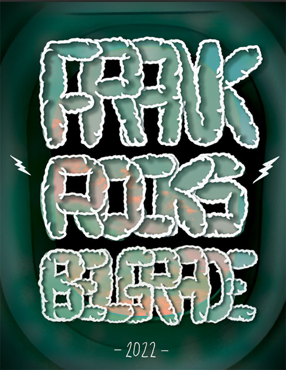
A long long time ago, I promised a dear friend that had moved countries that I will make her a playlist in celebration of the big move. It took me a long time to put the playlist together and when it was finally ready, I decided to fancy-up the experience a little and design a card with a QR code for her to scan and teleport to the playlist.
Started the project by finding a design direction and a style that ‘sparked joy’. Simultaneously, I was thinking of a title for the playlist. The title came before knowing what style I wanted which was: “Frank Rocks Belgrade”. Frank is the nickname I call my friend and Belgrade is where she is.
Once the name was set, the image of a hand-lettered card kept visiting my mind while still searching for design inspiration. One day, I decided to just roughly hand letter how I imagined the text to be…
–
I was not very convinced with what I saw so I took some time off the idea. Then after a while of continued brainstorming, I revisited the idea and thought that there is potential here and that it could work. So next was to choose what hand-lettering style do I wish to proceed with and I chose overlapping bubbly text. Then went on Pinterest, of course, and searched for different full alphabet typeface designs; bubbly, bold, modular, condensed. While doing that, I came across a short video on how to draw bubbly font and gave the technique a try and liked what I had:

–
I drew a few refined rough sketches before going digital with the sketch I liked the most and then started drawing on the computer:
–
–
Once again, it took a few trials on Photoshop drawing the bubbly text and I was liking what I saw on screen and it was getting closer to the feeling of the idea that sparked joy in the beginning. During the going back-and-forth digital drawing process, I tried giving the bubbly text a little more character by drawing it using curvy and slightly rougher lines that made it look bolder yet fluffy. Again, I liked where this was heading and changed the whole drawing.
Then it was time to style the hand-lettered piece and that was a journey of trying out various looks and colours:
–
At this point of the project, I realised that there are infinite ways to present this hand-lettered piece and it was mind whirling. I found myself trying out many design possibilities until I saw this picture that I took with my phone and thought this could be something…
–
One thing led to another, I found myself attracted to this colour scheme of greens, pinks and a little bit of darkness and played and played around until I reached my destination:
–
–
Overview:
Happy to see this project go on the blog finally. Looking at it now, I can spot the places where the hand-lettering needs adjustments but on the whole, I am happy with the outcome. It has been a long long time since I’ve done any hand-lettering after September 17 – ‘Hamilton Hand Lettered’ (one of my favourites of Project_S).
Two things I am specifically happy about are; one: posting a project that is digital art / graphic design related after a few non-digital design projects. Two: happy about trying out a new design style. The colours as well as the hand-letting style were a new flavour for my taste. I had fun exploring the many possibilities this piece offered and I would like to create ‘sequels’ to this playlist and its covers in the future.
One thing I would do differently is to do a better job of the printing quality. After printing, I remembered that this printing place’s printers print darker than the actual design. In the past, I used to take my laptop with me and do the adjustments on spot. In the future I want to remember this point and adjust the final print files for that and maybe to try a different printing place and see how it goes.
I have yet to share it with my friend whom I shall be seeing some day hopefully soon.
Until the next post.. Stay tuned!
-S


